NZ Insights
Navigating the art investment landscape
Growing up, the walls in Joan Vujcich’s house looked very different to her walls today.
Sharon Zollner, Chief Economist
Miles Workman, Senior Economist
David Croy, Senior Strategist
ANZ New Zealand Ltd.
.jpg/_jcr_content/renditions/cq5dam.web.1331.1024.jpeg)
As 2021 has progressed, it has become increasingly clear that the economy has recovered well and is steaming ahead so quickly that it’s high time for the Reserve Bank (RBNZ) to start unwinding the emergency stimulus delivered in response to the crisis.
The RBNZ has already scaled back and then formally ended quantitative easing (“money printing”) and the next logical step is to start lifting the OCR, with the first hike expected next month.
While on the one hand that’s an endorsement of the strength of the economic rebound and the lift in confidence (and house prices), it also means borrowers will face higher interest costs in the months and years ahead.
In this article, ANZ New Zealand economists discuss what markets are telling us about how high interest rates might go based on a number of factors, and compare that to past cycles.
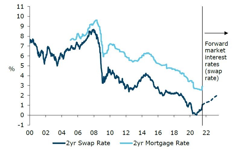
Figure 1 captures the lay of the land well. It shows where the 2-year swap rate (the benchmark wholesale rate that most heavily influences 2-year mortgage rates) has been, and where markets expect it to go in the future.
The chart plots the 2-year fixed mortgage rate, demonstrating the influence that swap rates have on mortgage rates.
It is worth noting that forward swap rates are actual market-traded rates that reflect the collective expectations of financial market participants. They are not our forecasts, but we will discuss that later.
Source: Bloomberg, ANZ Research
At the moment, the 2-year swap rate is around 1.05%, and markets expect it to rise to around 1.65% in 2 years’ time, then on to around 1.8% in 3 years’ time, and just above 2% in 5 years’ time.
That’s not a large rise in the context of where the 2-year swap rate has been in the past 20 years or so. However, remember that this rate went negative (yes!) at the end of 2020 and it has already doubled from around 0.5% a couple of months ago.
Yet 2-year mortgage rates have only risen recently, and by much less than that. That being the case, there are some clear signs here that mortgage rates (which tend to follow swap rates fairly closely) are likely to continue to rise.
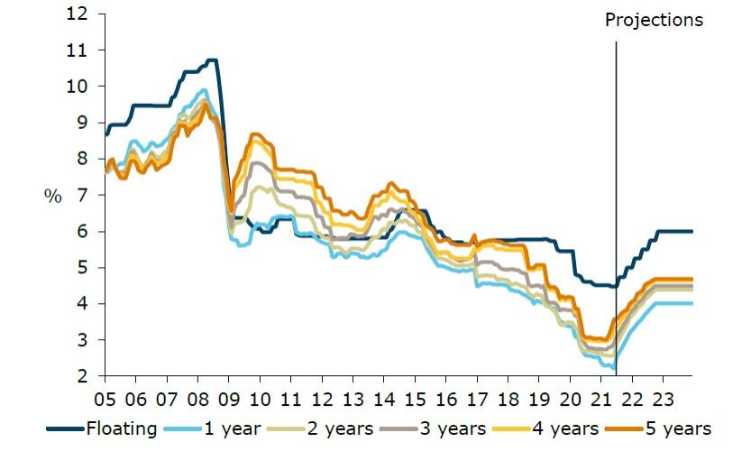
Figure 2 is similar, but it shows ANZ’s projections for fixed mortgage rates, these being the rates that actually end up impacting household wallets.
There are too many uncertainties and moving parts to call this a formal forecast – it’s more of a ‘what if’ scenario.
It takes our 2-year swap forecasts (itself influenced very heavily by our OCR forecast), and assumes for the sake of argument that mortgage margins (the spread between the swap rate and the mortgage rate) gravitate towards historic averages, to show where mortgage rates may go.
Source: RBNZ, ANZ Research
This exercise shows that all mortgage rates could top 4% over the next year (figure 2). Some mortgage holders will be relatively ready for that, especially those who have fixed for longer terms over the past year or so.
But even that will only delay inevitable rises, unless we see market interest rates fall in the future.
That is certainly possible, if for example another crisis were to come along, prompting the RBNZ to slash interest rates again.
But that’s probably a case of ‘be careful what you wish for’ in terms of comfortably making your mortgage payments! And rate cuts are not something we currently expect based on the outlook as it stands now.
New Zealand has experienced many episodes of rising interest rates in the past, so the idea that debt will cost more to service is not in itself particularly novel. But it’s fair to say we’re a bit rusty at confronting rate rises.
And what will make the upcoming increase in interest rates unique is that household debt levels have never been as high they are now, nor grown as quickly as they have over the preceding 12 months.
And on top of that, households have minimal levels of time-certainty, having understandably opted for shorter rather than longer-term fixed mortgage terms for cost reasons. The Government has gone in the other direction, having extended the term of its borrowing to beyond 20 years.
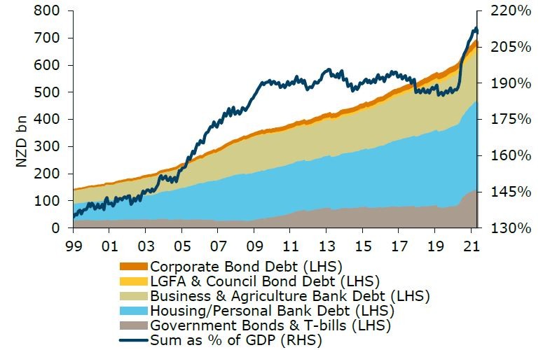
Figure 3 plots our best estimate of total debt across various sectors of the economy in a way that tries to avoid double-counting. Broadly speaking, there are five main categories of debt in the economy.
In the order we have put them on the chart, they comprise:
In total, these categories of debt stood at $692bn (around 213% of GDP) in April.
Source: Bloomberg, NZDM, ANZ Research
A staggering $99bn of that debt has been accumulated since the end of 2019, which was just before COVID struck.
In percentage of GDP terms, the jump was 27%pts (from 186% to 213% of GDP), making the five years after the GFC (when the total grew from 181% to 192%) look like child’s play.
In per capita terms, total debt by this measure rose from $118k per person at the end of 2019 to $135.5k in April. Again, that’s a big jump. With 2.7 people on average per household, that’s an increase of approximately $47k per household.
To put things in perspective, in the year to June 2020, average annual household income rose by only $3k, from $104k to $107k.
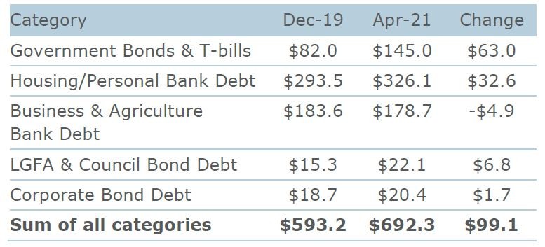
It’s difficult to see clearly on Figure 3, so for completeness, Table 1 shows the change in dollar terms for each of the debt groupings. Of note, the only category where debt fell was the businesses and agriculture grouping, whose debt shrank by $4.9bn.
The big borrowers were the Government (that boils down to you and me – and even more so, our kids), who borrowed an additional $63bn, and households, who borrowed an additional $32.6bn.
Source: Bloomberg, NZDM, ANZ Research
It’s worth noting that we have deliberately omitted categories such as bank debt raised in the bond market because this is on-lent to households and businesses, which we have already counted.
We have also omitted debt raised in the bond market by offshore companies, as this is not a liability of anyone resident in New Zealand. We could have cut the data differently, but this snapshot captures the overall situation pretty well.
Had we added some of the excluded categories, the picture would look even starker.
No matter how you cut it, the more debt there is in the economy, the more sensitive the economy is to rising interest rates, with more pressure on indebted households, businesses and the government to either cut back on spending or increase prices or taxes, and that will have knock-on impacts on the wider economy.
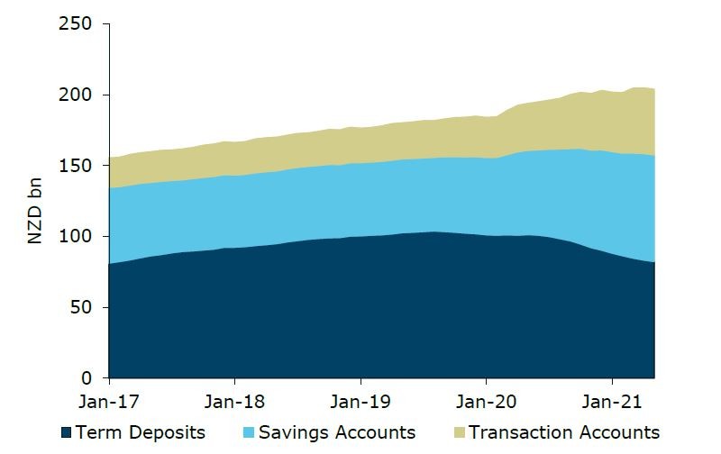
What about savers? They’re better off when rates rise, if their cash is in the bank. Figure 4 shows the volume of household deposits at New Zealand banks.
They ticked up when the wage subsidy was distributed, but most of the growth seen was in transaction and savings accounts, which earn little or no interest. The volume of term deposits has actually shrunk since last year, thanks mainly to lessattractive
term deposit rates recently.
Since the GFC, term deposits have generally paid interest at a rate that significantly exceeds the OCR.
However, with the OCR at 0.25%, even with a wide margin, term deposit rates have been low, and the lack of take-up at the household level will dilute the positive impact of rising interest rates.
Source: RBNZ, ANZ Research
It’s not just the volume of debt out there that determines how borrowers will be affected by rising interest rates, but also the structure of that debt.
Source: RBNZ, ANZ Research
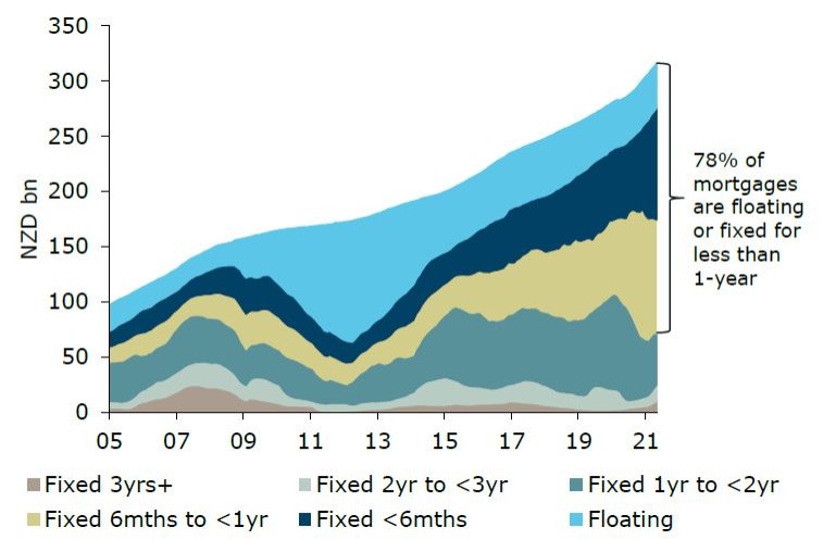
Figure 5 plots the aggregate volume of New Zealand mortgage debt (secured over residential property) split by remaining fixed term.
Households have benefitted from last year’s dramatic falls in mortgage rates, with the average special rate on a 1-year
mortgage term falling as low as 2.21%, according to the RBNZ.
But because it has cost more to fix for longer throughout the entire time since the COVID crisis began, households have traded off longer-term certainty for immediate savings.
As a result, a historically high proportion (nearly 80%) of mortgage debt is now either floating, or fixed for less than 1 year. That, as well as the level of debt, leaves households more vulnerable now that interest rates are rising.
Put bluntly, households will feel the pinch of rising interest rates harder and sooner this time around.
Based on the latest data, a 1% increase in interest rates will cost households $3.1bn extra a year, which is around 1% of GDP.
Of course, the staggered nature of fixed rate roll-offs does mean that households will have time to think about that, but theprospect of these increases is likely to weigh on sentiment immediately, even if it doesn’t hit cashflow till later.
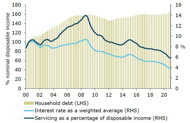
While the amount of mortgage debt has risen sharply over the past year, adding to already-high levels of debt, lower mortgage rates have cushioned the blow.
This is demonstrated in Figure 6, which shows that debt-servicing costs as a percentage of household income (dark blue line) have continued to fall as interest rates have fallen (light blue line).
Higher incomes have also helped, but lower interest rates have provided most of the tailwind.
So the obvious corollary is, what might happen to house prices and confidence once this tailwind becomes a headwind?
Source: RBNZ, ANZ Research
Higher interest rates won’t impact most existing mortgage holders immediately, thanks to the popularity of fixed-rate mortgages. But as noted earlier, it will feed through quickly.
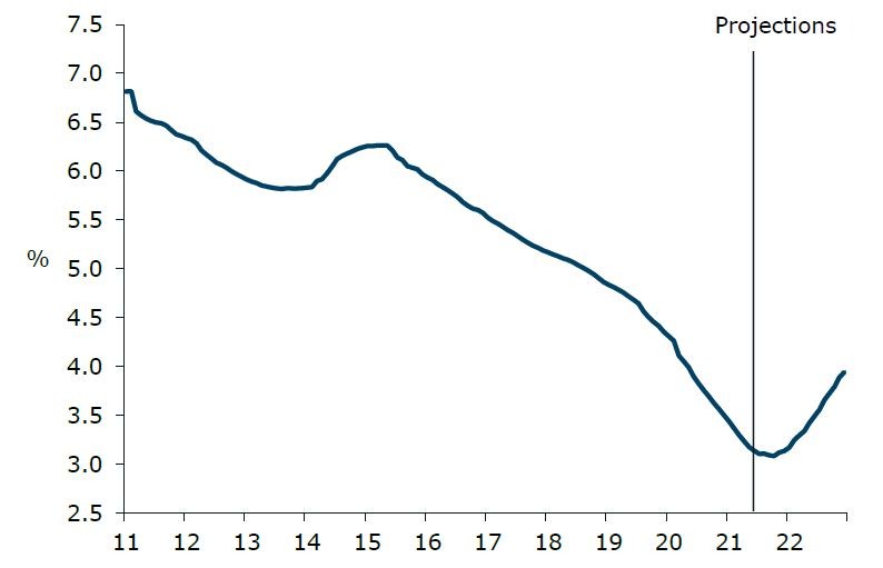
Our modelling of this is encapsulated in what we call the “effective mortgage rate”, which captures the actual interest rate that most home-owners are paying when we account for the date they fixed their mortgage rates.
As figure 7 shows, the effective mortgage rate is set to rise from the end of this year as those on historically cheap rates roll into new, higher rates.
The effective mortgage rate is unlikely to rise to the levels prevailing pre-COVID, but it will probably rise more rapidly than it has in past cycles, bringing a swift end to the tailwind of years of falling rates.
Source: ANZ Research
So is it the change in the mortgage rate that matters, or the level? Both do, of course. While the former is arguably more related to confidence effects, the latter is pretty ‘real’ in terms of cashflow.
Of course, it hasn’t been just the debt side of the balance sheet that has grown over the past year; so too has the asset side of the ledger.
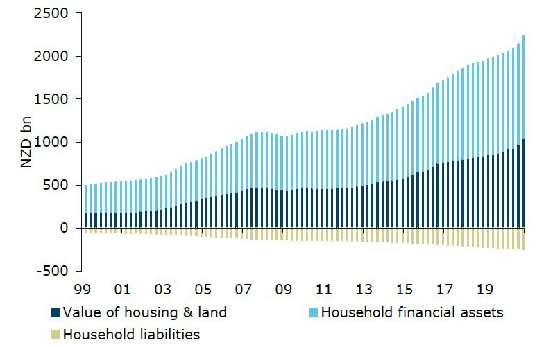
Source: RBNZ, ANZ Research
Figure 8 shows that while household debt has grown rapidly, household financial assets and the value of housing and land have grown even more rapidly.
Despite the rise in indebtedness, household balance sheets are technically in better shape than they were a year ago, or have ever been.
That said, those gains are unrealised, and could be fleeting – asset or house prices can easily fall, whereas the value of the debt
will only fall if it’s paid back or defaulted on.
This is important, as financial asset prices (and house prices) tend to be very sensitive to the level of interest rates.
If some of the wealth created by falling interest rates is wiped out as interest rates rise, that could weigh severely on confidence and spending, which may in turn limit how many OCR hikes the Reserve Bank actually ends up delivering.
There are also other reasons to expect interest rates to rise by less over the coming cycle than in past cycles.
One key reason is the unknown impact on the economy of the cessation of quantitative easing (QE), which is the modern day equivalent of money printing.
As many readers will be aware, the Reserve Bank has been buying significant volumes of bonds since the COVID crisis struck, via its Large Scale Asset Purchase (LSAP) programme.
The LSAP delivered three main benefits to the economy (though certainly debate rages about the scale of its real impacts, which will never be demonstrable).
While QE did not directly impact the housing market, the build-up of additional liquidity in the banking system did mean that it indirectly supported asset prices, including house prices.
When talking about its monetary policy options, the RBNZ actually warned the Government that QE could inflate house prices,
and it now seems clear that it was one of the driving factors.
So as a result, it’s reasonable to assume that there will be some impacts on the other side too, as QE is ceased and eventually unwound.
The LSAP QE programme has now ceased, and that does mean there is less stimulus coming through those three channels, and less liquidity chasing asset prices, including housing.
We need to be clear about the phasing of this.
During the initial “purchase” phase of QE, liquidity is being created (that’s the “money printing” bit), and as this liquidity makes its way through the plumbing of the financial system, it drives down bond yields, suppresses the exchange rate, and fuels lending, which in turn helps boost house prices.
That phase spanned the period from March 2020 until last week.
The second phase (which began this week) is the “neutral” period, where no more bonds are being purchased. That takes away a tailwind, but there isn’t yet a headwind.
The final phase begins when the bonds that were purchased mature.
At this stage, if the proceeds are not reinvested (and it is likely that they won’t be, or at least not fully – after all, QE was only supposed to be temporary), we will see a reduction in liquidity.
This is known as quantitative tightening (QT) and it is akin to the “printed money” being “burnt”.
It is not clear what impact this third phase (QT) will have on the economy, but historic international experience and logic suggest that it will have a negative impact on growth, and that could temper the need (or the ability) for the OCR to go higher.
In essence, QT could see longer-term interest rates rise (which affect business and the government more), leaving less room for short-term interest rates (which affect households more) to rise.
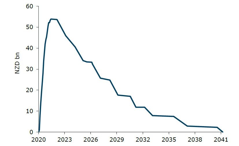
Source: Bloomberg, RBNZ, ANZ Research
Figure 9 shows the run-off profile of the approximately $54bn of bonds that have been purchased. It runs off a lot more gently than it was ramped up, and that will help soften the blow.
The first major QT date to diarise is April 2023, when around $7.7bn of bonds mature. If not all of those are rolled over, QT will have begun.
QE also occurred via the Reserve Bank’s Funding for Lending (FLP) programme, under which the Reserve Bank pledged to lend banks up to $28bn (approximately) over three years.
This programme remains in place, so even though LSAP purchases have now ceased, there is still more QE to come.
The FLP was introduced to make cheap funds available to banks to on-lend. The drawdown window of the programme spans 2 years, between December 2020 and December 2022.
If banks make full use of this programme, that will add around $28bn to the amount of “printed money” to the system (on top of the roughly $54bn of bonds already purchased).
Because banks have not yet taken their full allocations allowed under this facility (only $3.7bn of the $28bn has been drawn), the near-term impact will be more QE, as the remaining $24bn or so of it is drawn down.
But as these loans mature in three years’ time, that will lead to further QT as they roll off (forcing banks to replace this funding elsewhere).
Forecasters and markets alike are flagging the likelihood that interest rates are likely to rise later this year, taking the OCR back above 1% by the first half of next year, and nearer to 2% by the end of the year.
If that does occur, mortgage rates are almost certainly going higher. Yet many households are relatively unprepared for this, having opted for shorter-term fixed mortgage terms that have been cheaper than longer terms, which obviously offer greater certainty.
Household balance sheets have never been stronger, with growth in housing and financial asset values outstripping growth in debt. Indeed, this goes a long way to explaining why in aggregate households are currently spending so freely, though the gains have been extremely unevenly distributed.
But while the asset side of the balance sheet has enjoyed strong paper gains, much of this is unrealised, and could easily be eroded if the economy sours, another crisis comes along, or if a tightening of monetary policy causes asset prices to stop increasing, or even fall.
Overall levels of debt remain very high, and servicing this debt has been made easier by the multi-decade fall in interest rates. But that trend is now coming to an end, and what was a tailwind will soon become a headwind.
As threatening as that sounds, it’s this very phenomenon (ie the sense that higher interest rates might start to bite) that has the potential to temper how high interest rates may go this coming cycle, and that’s a key reason why we have the OCR peaking at “only” 1.75%.
Such a rate would have seemed very low historically (in fact, the OCR bottomed out at 2.50% in the immediate aftermath of the GFC), but in the current environment we are confident that unless inflation gets away on the Reserve Bank (which is a possibility, but not our central scenario), 1.75% ought to do it.
The unknown impact of the end of QE and an eventual move towards QT will also limit the extent to which interest rates can or need to go higher as the resultant tightening in financial and funding conditions bite, taking some pressure off the OCR.
Stepping back, it’s worth thinking about the bigger picture – which is one of an economy that has taken on another $100bn of additional debt since the end of 2019 (an increase of around 17%), yet the number of filled jobs only rose 1%.
Had they also been up by a similar amount, and there were perhaps 17% more cows on farms being milked, or 17% more orchards producing fruit, or perhaps 17% more manufacturing output, that extra debt might not be a problem.
But the productive capacity of the economy hasn’t grown by anything like that amount. That doesn’t mean interest rates can’t rise – it just limits how far they can rise without becoming a serious drag on economic activity in New Zealand.
NZ Insights
NZ Community
NZ Insights